Stories that I tell through design…
Stories that I tell through design…

This is a reflection of my journey across different design disciplines, blending my background in architecture with visual storytelling to create thoughtful and engaging visuals.
This is a reflection of my journey across different design disciplines, blending my background in architecture with visual storytelling to create thoughtful and engaging visuals.
This is a reflection of my journey across different design disciplines, blending my background in architecture with visual storytelling to create thoughtful and engaging visuals.
Branding and Collateral: TEDx Faurot Park at Lima Ohio
Branding and Collateral: TEDx Faurot Park at Lima Ohio
Branding and Collateral: TEDx Faurot Park at Lima Ohio
Tools Used: Adobe Illustrator, Adobe Photoshop
Tools Used: Adobe Illustrator, Adobe Photoshop
Tools Used: Adobe Illustrator, Adobe Photoshop
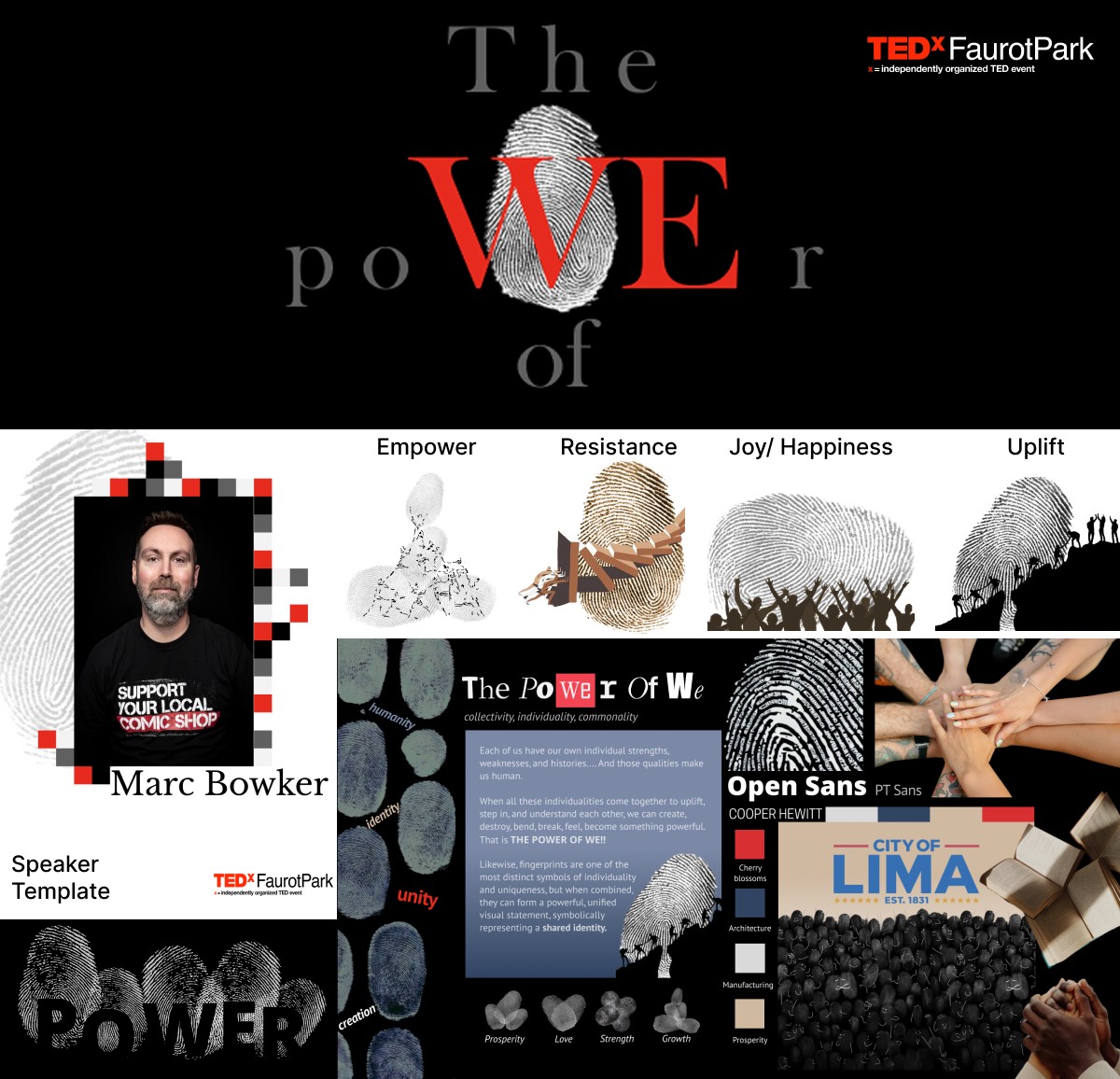
Our team at The Creative Agency was commissioned by TEDx Faurot Park to design the branding and event collateral for their upcoming event in Lima, Ohio, themed “The Power of We.”
Among the concepts we presented, I developed this visual direction using fingerprints to symbolize individuality coming together as a shared identity. I was responsible for visualizing and refining the concept- designing the mood board, selecting typography, and creating speaker profiles to express the theme with clarity and impact.
City Illustrations: Citydle App
City Illustrations: Citydle App
City Illustrations: Citydle App
Tools Used: Adobe Illustrator, Figma
Tools Used: Adobe Illustrator, Figma
Tools Used: Adobe Illustrator, Figma
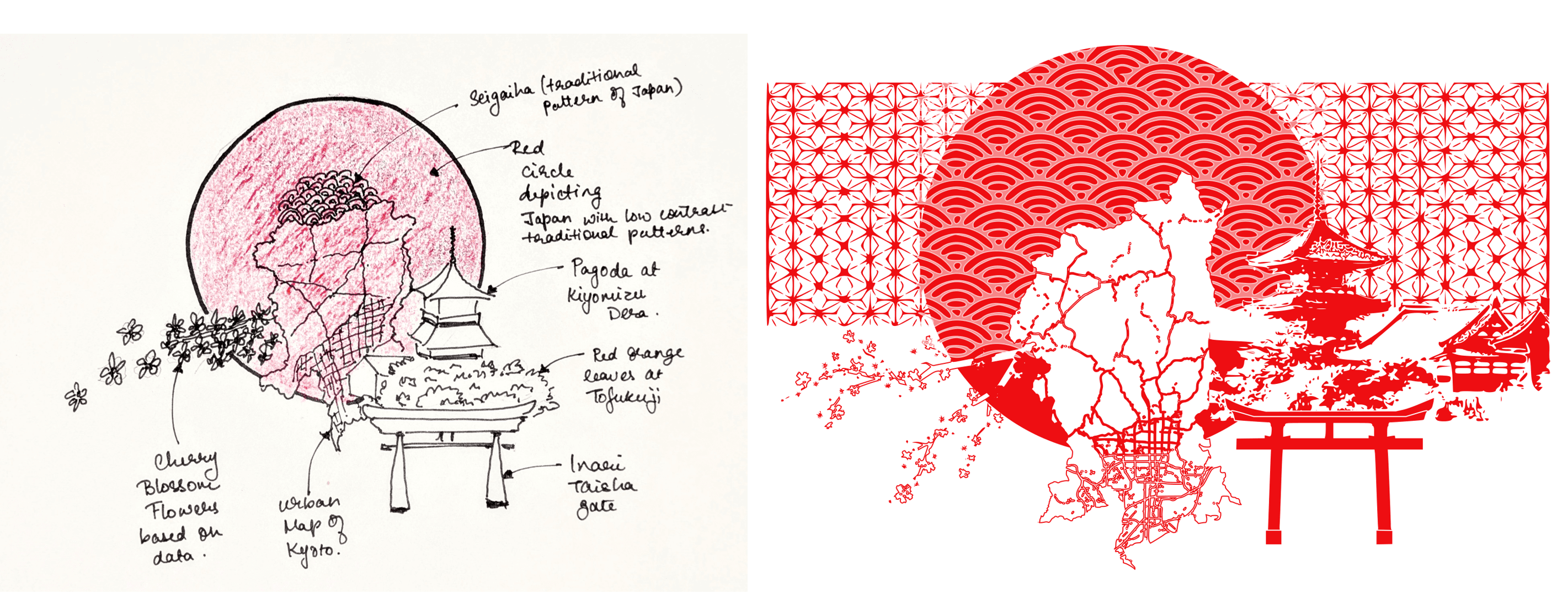
This illustration was created as part of Citydle, a conceptual gaming app exploring cities through minimalist design.
Starting with Kyoto, I researched its architecture, landmarks, and textures to capture the city's layered cultural identity. I first created a concept sketch to map out the composition, then translated it into a red-and-white illustration with the city’s key landmarks, materials, and textures that define Kyoto’s identity.
This piece is part of a larger series, with similar illustrations developed for other culturally rich cities.
Typeface Persona App design: Neue Haas Grotesk
Typeface Persona App design: Neue Haas Grotesk
Typeface Persona App design: Neue Haas Grotesk
Tools Used: Figma
Tools Used: Figma
Tools Used: Figma
As part of an academic exploration into typography, I created a prototype app centered around Neue Haas Grotesk typeface. The goal was to bring the typeface’s personality to life—clean, reliable, and quietly confident. Think of it as the polished professional of typefaces- never loud, always intentional. From interface flow to animation, this concept was my take on showing how type can have character without saying a word.
As part of an academic exploration into typography, I created a prototype app centered around Neue Haas Grotesk typeface. The goal was to bring the typeface’s personality to life—clean, reliable, and quietly confident. Think of it as the polished professional of typefaces- never loud, always intentional. From interface flow to animation, this concept was my take on showing how type can have character without saying a word.
As part of an academic exploration into typography, I created a prototype app centered around Neue Haas Grotesk typeface. The goal was to bring the typeface’s personality to life—clean, reliable, and quietly confident. Think of it as the polished professional of typefaces- never loud, always intentional. From interface flow to animation, this concept was my take on showing how type can have character without saying a word.
Data Visualization: Frequency analysis in poetry
Data Visualization: Frequency analysis in poetry
Data Visualization: Frequency analysis in poetry
Tools Used: Figma, Adobe Illustrator, Adobe Indesign
Tools Used: Figma, Adobe Illustrator, Adobe Indesign
Tools Used: Figma, Adobe Illustrator, Adobe Indesign
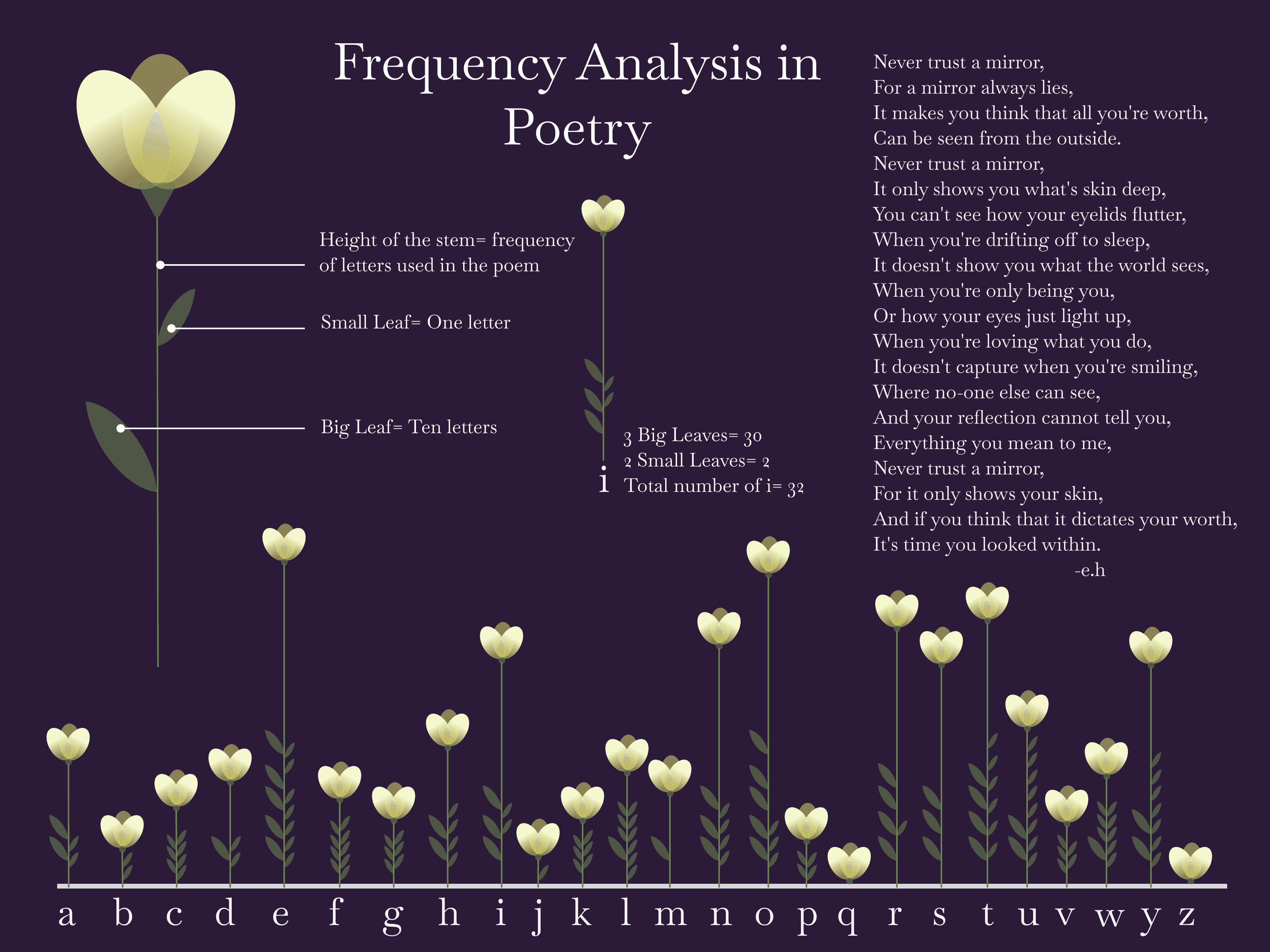
Inspired by the work of Federica Fragapane, this project is an exploration in data visualization through poetic structure. I visualized the frequency of letters in “Never Trust a Mirror” by my favorite poet, Erin Hanson, turning the text into a botanical landscape.
Each flower represents a letter, with stem height showing how often it appears in the poem. Small leaves indicate single counts, while large leaves represent groups of ten.
This piece merges emotion and information, showing how data can tell a story as delicate and meaningful as the words themselves.
Logo Design: Pelvic Pro Physical Therapy
Logo Design: Pelvic Pro Physical Therapy
Logo Design: Pelvic Pro Physical Therapy
Tools Used: AutoCAD, Adobe Illustrator
Tools Used: AutoCAD, Adobe Illustrator
Tools Used: AutoCAD, Adobe Illustrator
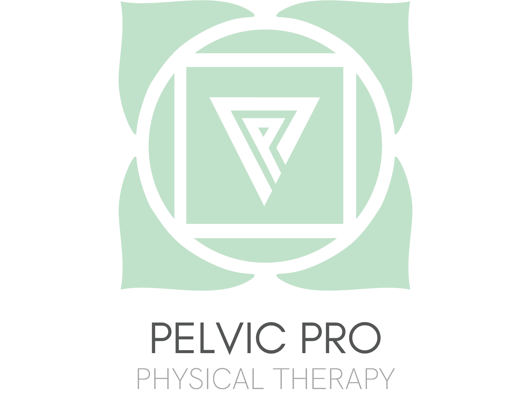
This freelance project involved designing the brand logo and color palette for Pelvic Pro Physical Therapy, a clinic specializing in pelvic health.
The logo draws inspiration from the Root Chakra, which governs the pelvic region. Its symbol—a four-petaled lotus with a square and inverted triangle—was abstracted using the initials of Pelvic Pro to form the triangle. The chosen light pastel cyan evokes calmness and relaxation, aligning with the clinic's healing mission. The branding was created for use on their upcoming website and merchandise.